Startup project
Role
Product Design Intern
Timeframe
2024 (3 months)
Team
Mike Doan
Hitomi Abiko
Florian Ludot
Sarah Vang
Alex Sebastiano
Mick Smit
Skills
Product
UI/UX
Research
Branding
Marketing
TLDR
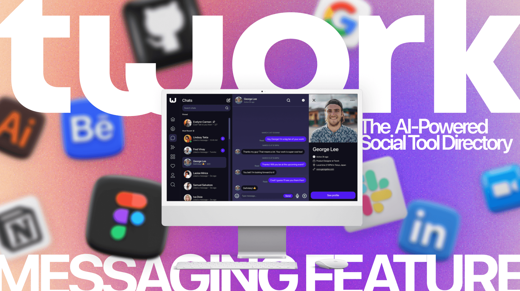
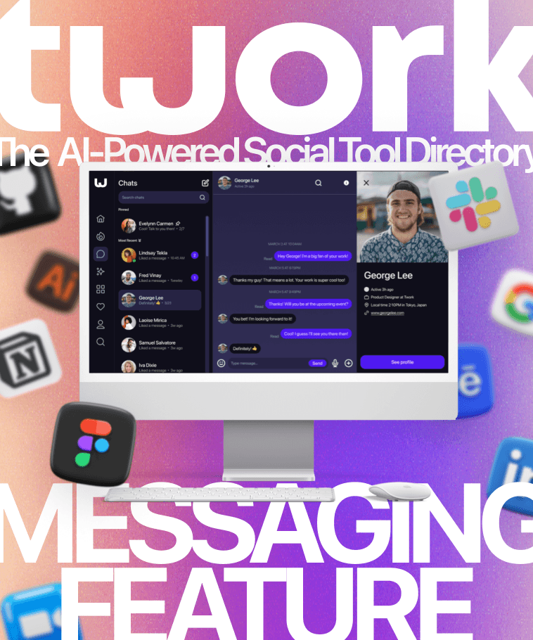
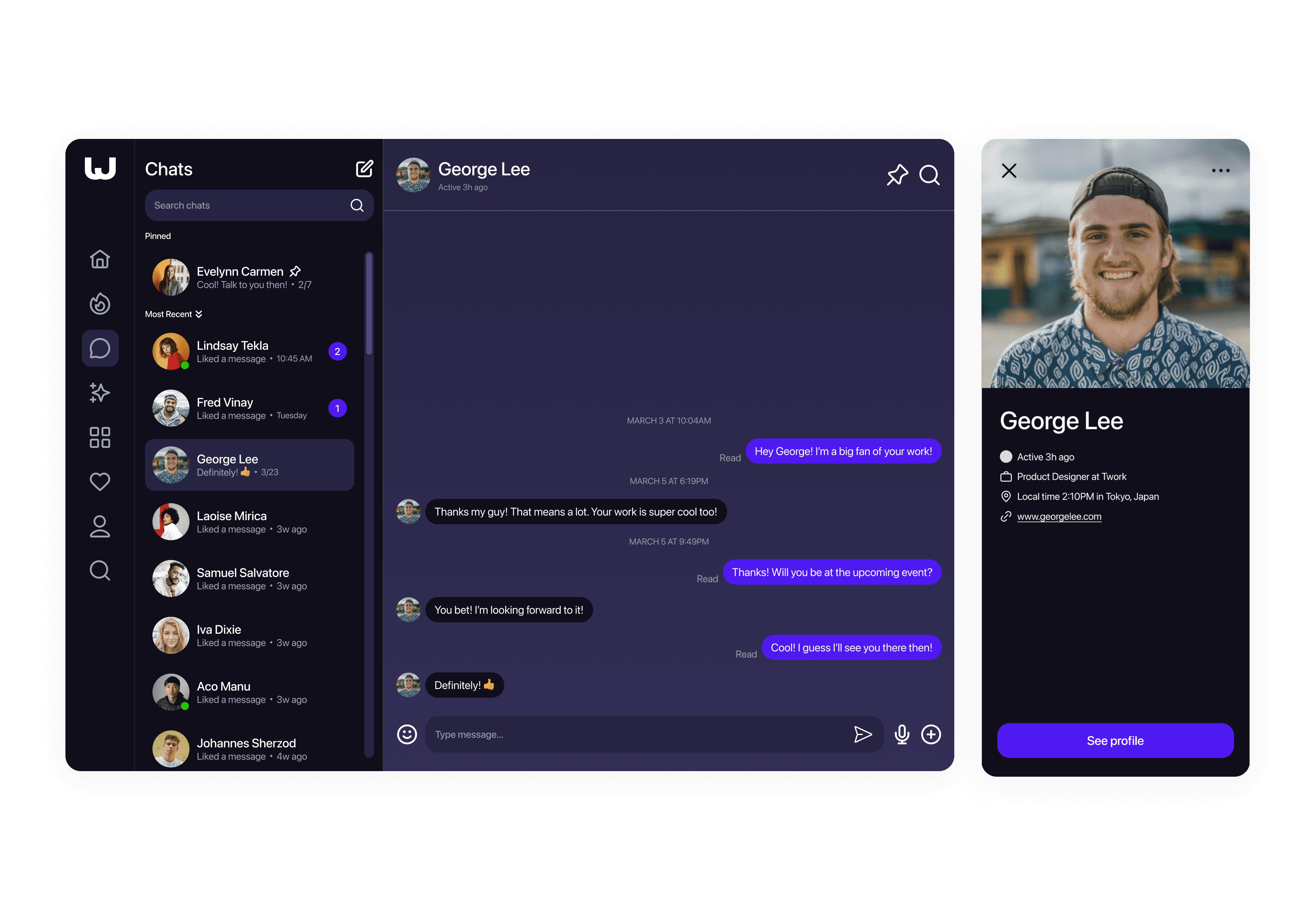
During my internship at Twork, an AI-powered social tool directory, I designed a messaging feature to help creative professionals connect, collaborate, and stay on top of the ever-growing library of online tools and technologies.
THE IDEA
Accessing curated selections of game-changing online tools from fellow creatives could transform the way you work.
THE PROBLEM
We can't keep up.
Let's be honest, every day it feels like someone is talking about some sort of new tool or product that people are using at work. Whether it's using generative AI to streamline your workflow, how to go viral on TikTok to promote your brand, or organizing every aspect of your life on Notion, there's always something new. How do we keep up with all of it?
Too Many Tools
1000+ new AI tools were introduced to the market in April 2023 alone.
Higher Demand
62% surge in the utilization of video conferencing applications was observed amidst the COVID-19 pandemic.
New Technology
91% of UI/UX designers report that they are likely to use generative AI into their future professional work.
the solution
The Social Platform for Professionals' Toolkits
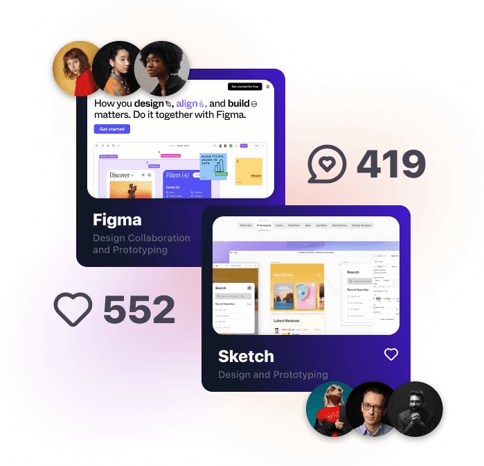
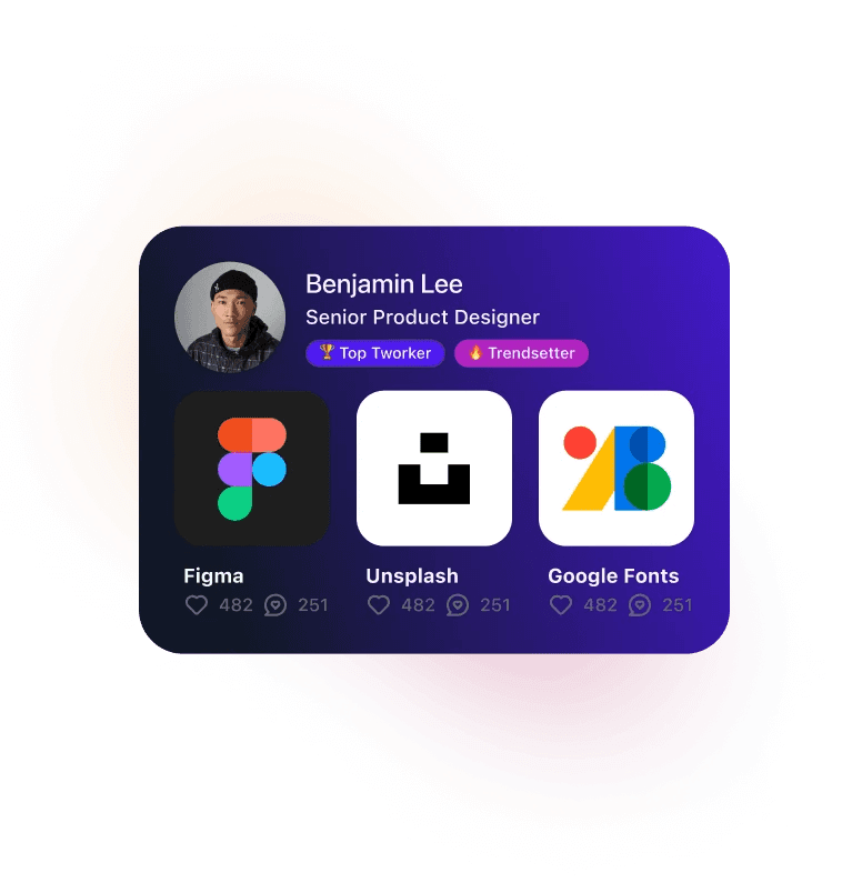
With a database with over 650 tools, Twork is the only social media platform dedicated to professionals showcasing their "tworklists", turning everyday users into industry influencers.
Socially Vetted Tools
Make tool decisions faster.
Showcased Tools
For SaaS Companies
Gain insights about your fast-moving industry.
the project
As they say, teamwork makes the dream work.
Using Twork not only to discover new tools but also to collaborate with others to share how to utilize them could change how we work. We aimed to design a messaging feature for the Twork platform to give users a way to achieve just that.
research
If it ain't broke, don't fix it.
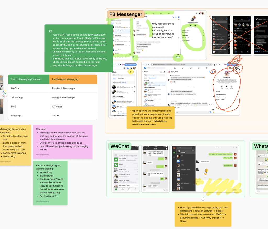
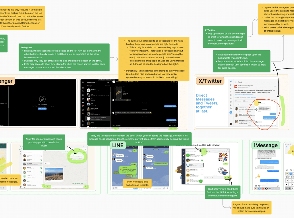
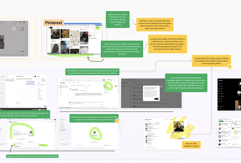
There's already so many messaging tools out there that users have developed a general understanding of how to use them. But how could we design to fit our users' specific needs? We analyzed the most popular messaging apps like Slack, WhatsApp, WeChat, Instagram Messenger, TikTok, iMessage and more, to discover what we definitely should not change, but also what we could add. This research helped us identify key features and design patterns that we wanted to incorporate into our messaging feature.
the design
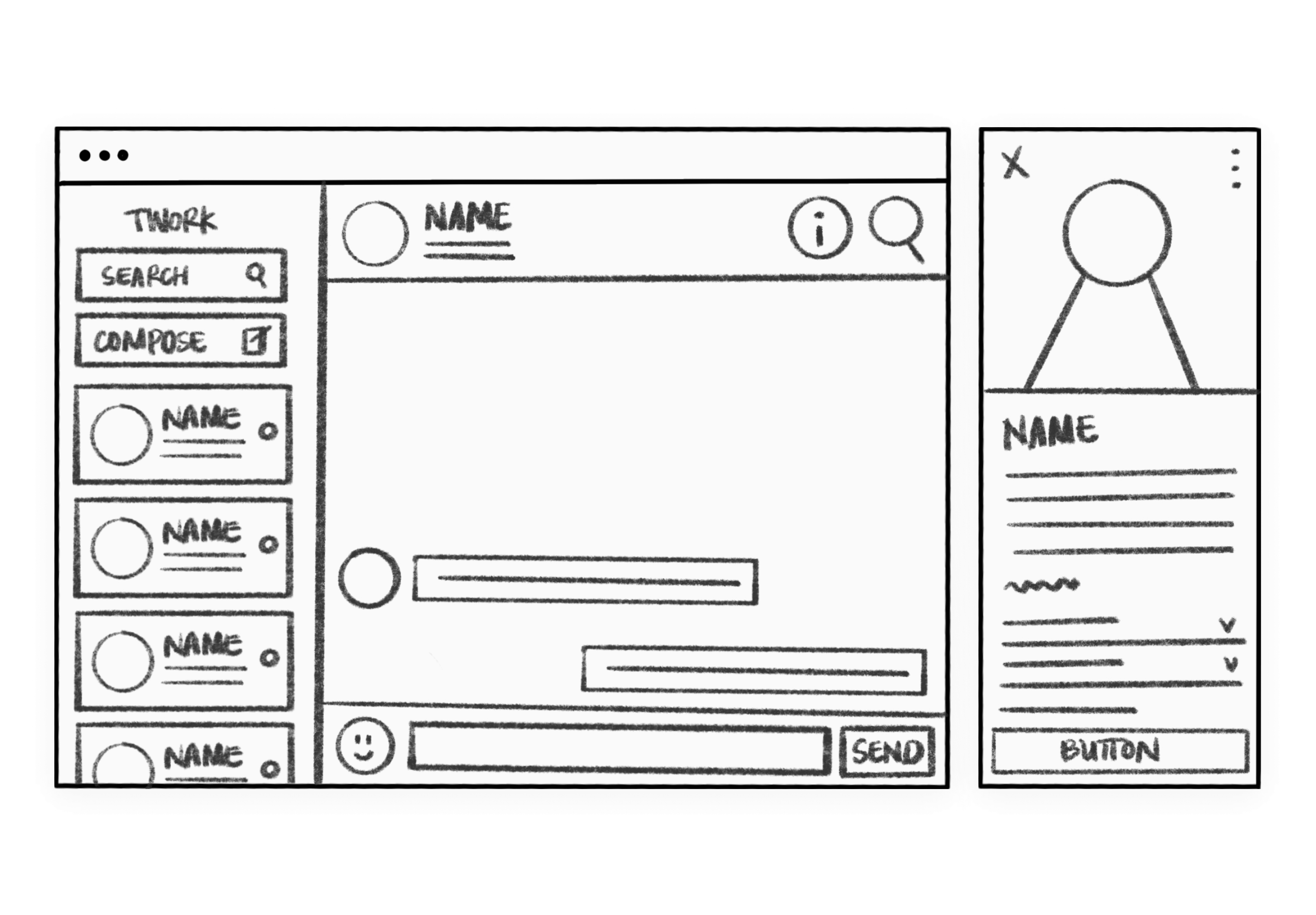
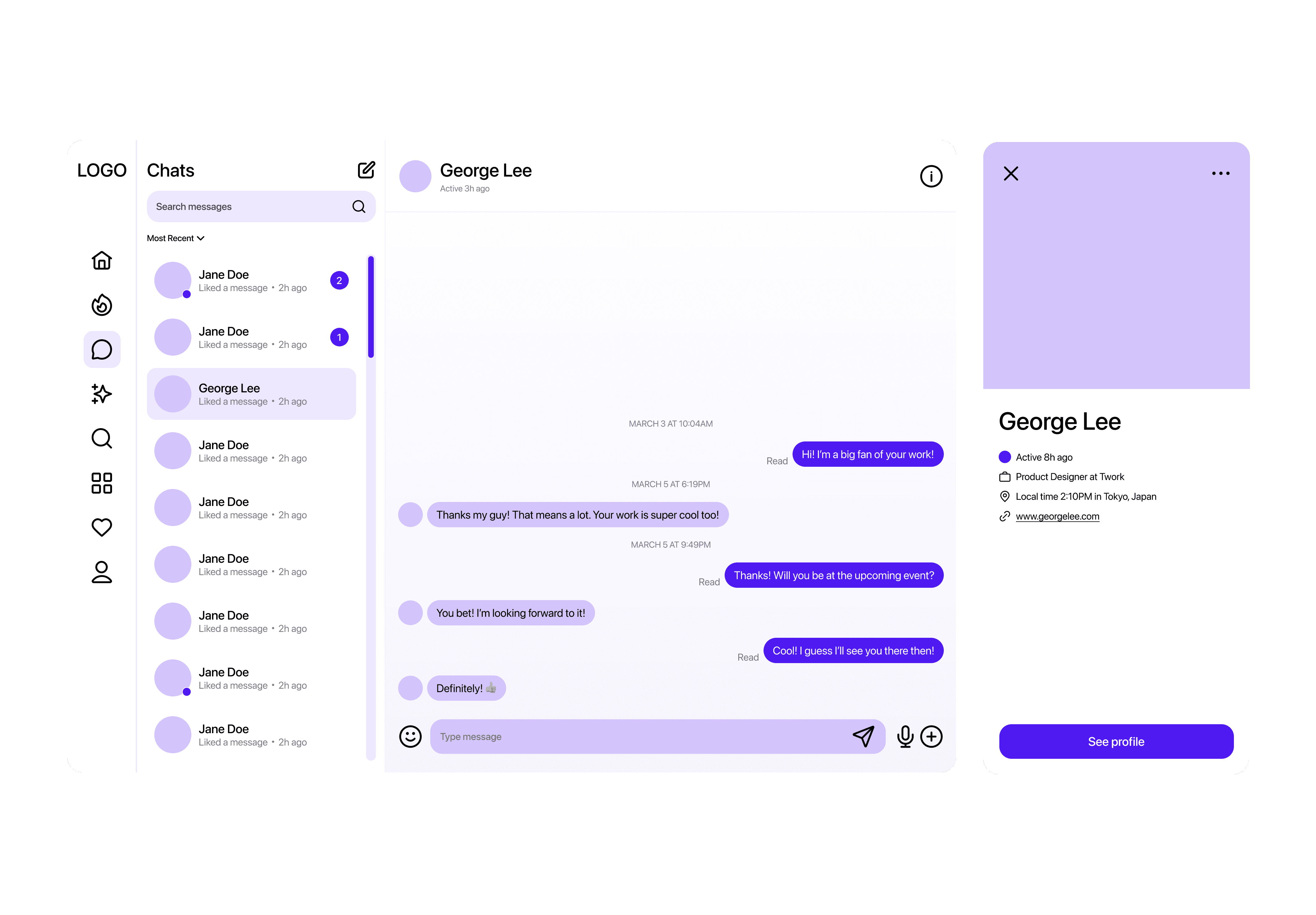
We started with low-fidelity wireframes to outline the basic structure and flow of the messaging feature. These initial sketches allowed us to iterate quickly and gather feedback from stakeholders. Once we had a solid foundation, we moved on to high-fidelity prototypes using Figma.
usability testing
After conducting a few rounds of user testing, our main points of feedback were:
1
The information icon was confusing.
2
Readability was difficult.
3
Colors were hard to distinguish.
final designs
Based on the results from our usability testing, we made the following design iterations:
1
